Production Map
The production map is the page that allows you to determine whether there are problems in the inverters and strings of station by proportioning the powers they produce to the powers they can produce and coloring them according to each other.
Note: The data is calculated in the measuring period of the datalogger.
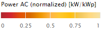
Coloring indicates kW/kWp ratio. Values range from 0 to 1. As the AC power approaches the peak value, the kW/kWp value will approximate to 1 and color will approach light yellow in the same proportion. If the inverter does not produce, its color is seen as red, that is 0. If the color is dark red, it means that data could not receive from the inverter. The value is seen as N/A when the mouse comes to the dark red region.
Note: In the "Pages" tab, production maps of different station can be added and production data of more than one station can be viewed on a single screen.
Inverter Production Map
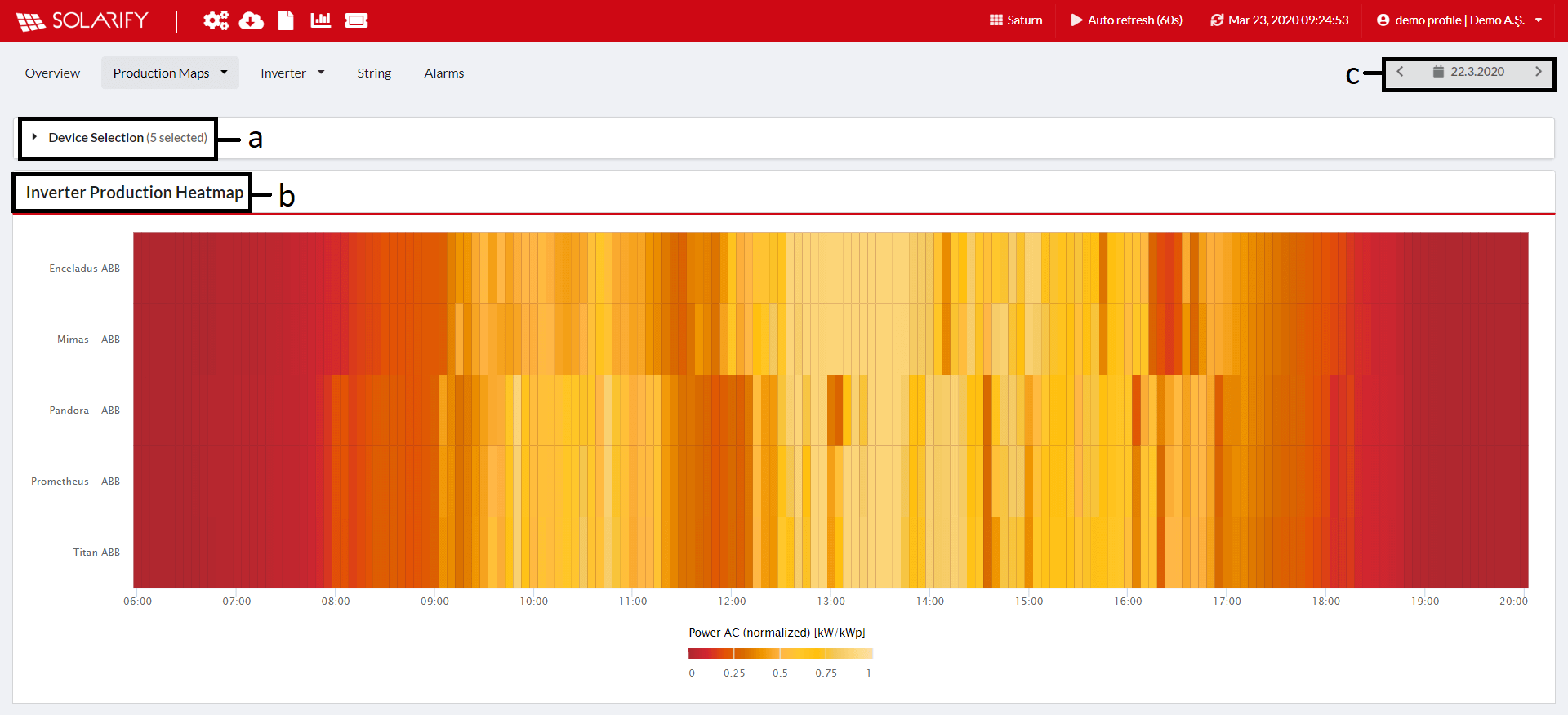
a) Allows device selection. One or more selections are allowed.
b) The column written by the type of the map. 'Inverter Production HeatMap'.
c) It allows us to change the date of the production map.
String Production Map
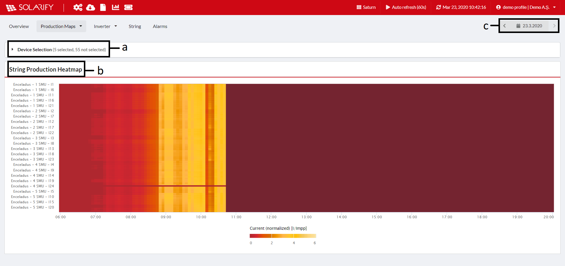
a) Allows device selection. One or more selections are allowed.
b) The column written by the type of the map. 'String Production HeatMap'.
c) It allows us to change the date of the production map.